Understand The Data You Use for Investing (Part 1)
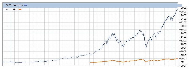
I was having a discussion the other day with someone about investing in international equities. Her belief was that international stocks have significantly underperformed U.S. stocks for a long time, and therefore she did not see any value in adding them to her portfolio. As proof, she cited the following chart from the Wall Street Journal site, comparing the performance of the Dow Jones Total Stock Market US Index with the Dow Jones Global Index from 1971 through June 2017:
At first glance, I could see why she had concluded that you’d get a lot more growth by investing in the U.S. stock market. Unfortunately, she was not properly interpreting the data on the chart. This particular chart plots the cumulative percentage return of the two indices. The problem with the comparison is that the international index did not come into being until 1994. The U.S. index had a twenty-three year head start, and as you can see, was already up over 400% by the time the international index entered the picture. Not only that, the 2900% growth of the U.S. index over the full time range compressed the y-axis, making the international index growth look positively anemic by comparison.
So the first lesson is never to compare cumulative growth curves that do not start concurrently. But in addition to addressing that, here’s a side question about the data above: since the cumulative growth of the U.S. index was about 400% from 1971 – 1994, and about 2900% from 1971 – 2017, does that mean the growth from 1994 – 2017 was 2900% – 400% = 2500%?
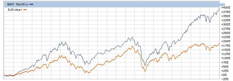
Let’s find out the answer to both questions. Here’s the same chart with the start time changed to 1994:
You can see that the performance of the two indices is a lot closer, although over the period in question the U.S. index still grew more than twice as much as the international index.
What about the answer to the side question above? Did the U.S. index grow 2500% during this period? Not even close. It was only about 390%. That’s because cumulative growth expressed as percent is calculated geometrically, not arithmetically. Rather than going into the detail of the mathematics here, suffice it to say that you cannot apply simplistic arithmetic to portions of data curves. The only thing we can infer from the chart above is that if you had invested money in an international stock index fund in 1994, you would have earned less than if you had invested that money in the U.S. stock market, regardless of the year in which you subsequently sold it.
Does that mean you should avoid international investing? No. It only means you should have avoided it in 1994. Wait till you see some data in next week’s post that will give you a totally different perspective.


